Retina Display
With Apple introducing Retina displays in all of their devices, and other manufacturers following up with their own high density displays, we have reached a point where we now have print quality screens. Until now, digital screen quality was horribly low compared to print. Designers would have to proof using a printer. But now with Retina display quality, digital and print are of the same quality.
As a user, these are exciting times. Our screens have become so sharp, and so crisp, that the difference is really incredible. These new displays really are, absolutely gorgeous.
All of the images in this article are Retina ready. You can click on the image below to see just how large the files actually are.
What is DPI?
You can find the DPI of a device by using the Pythagorean Theorem. First we need to find the dimensions of the screen as well as its resolution. Dividing the diagonal of the screen resolution by the screen’s diagonal will derive the DPI.
a2 + b2 = c2
DPI = c2 / Screens Diagonal
For example
The Google Nexus 7 has a resolution of 1280 x 800 and a 7″ display
So…
1280² + 800² = C²
Or…
sqrt(1280² + 800²) = c
Or…
sqrt(1638400 + 640000) = c
Or…
sqrt(2278400) = c
Or…
1509.44 = c
Now we take that and divide by the diagonal to derive the DPI:
1509.44 / 7 = 215.6 DPI
There are already many smart phones and tablets that have an even higher DPI than this.
As web developers, Retina displays create some very big problems to overcome.
Technical Problems
By creating and posting an image on your site at triple the DPI we add more data to the same amount of space thereby making images appear crisper, and more detailed. The problem is that the vast majority of images and graphics created and posted on the web to date have been created for 72 DPI and not these higher pixel depths. When we try viewing these on a device that has a higher DPI, these older format images have to be re-interpreted by the device and rendered out to the best of their ability, which doesn’t translate as well as one would expect.
Add to this the fact that there are devices with 7″, 9.4″, 10″, 13″, 15″, 17″, 24″, 30″, and 60″ screens, it’s becoming a confusing mess.
Responsive design is the answer to this problem. We can use style sheets to automatically show the best design and layout for the specific display size visiting the site. The technical implementation is complicated, but as more and more device sizes (phones, tablets etc) with higher resolutions are being used, responsive design in web development will be absolutely required.
Speed Problems
The next major problem is with speed. Retina displays have four times the pixels, meaning every picture has to be four times as big. This means larger file sizes. As we know, page load times are an important part of web usability, Internet marketing, and conversions. Every 100ms increase in load time for Amazon.com decreases sales by 1%. The 2007 study, however, was the same year the iPhone was released, which arguably is the year that mobile Internet use exploded.

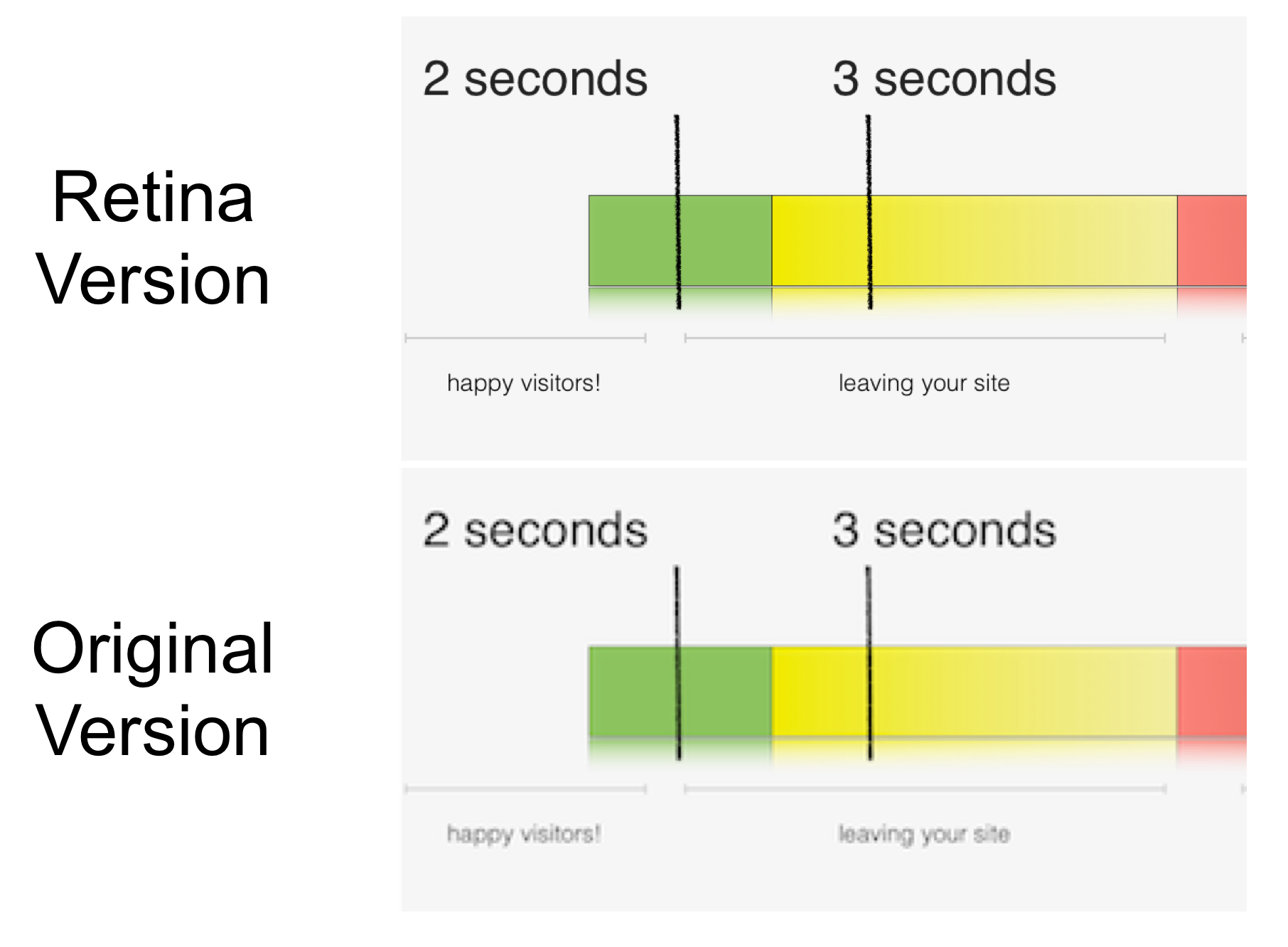
Comparing a Retina version to the original. Notice the smoothness of the text.
So while page speed is important to desktop computers, it could be said that it is even more important with mobile devices using slow mobile connections that are data capped.
So what kind of file size difference are we talking about here? The average Insight article on Relentless is about 1 to 2 megabytes. When we get the same articles ready for Retina graphics, the file size jumps to around 6 megabytes! When you consider visitors on an iPad using 3G, you can start to see the bigger issues that face web developers.
Cost Issues
As mentioned, page speed has a direct impact on a website’s conversion rate and ability to act as a sales tool. With studies correlating a drop in sales when a website is even milliseconds slower, imagine what a page load time of 30 – 40 seconds could do to an eCommerce conversion rate. What about minutes?
Then there is a bandwidth issue to deal with. Smaller websites with unlimited bandwidth packages won’t have too much of a problem, but larger websites like big publishers or eCommerce websites will have bandwidth to consider and increased storage costs.
There is also the issue of Internet Service Providers and data capping especially in countries like Canada. Most Internet Service Providers simply aren’t ready for Retina displays yet. Not with the speed, nor the bandwidth.
The Future
Retina displays are here to stay. Viewing the web on these displays is simply a “no going back” experience. And this is a good thing! But as Designers, Developers, and Business Owners, we will all need to start thinking of how to ensure our existing sites and new ones look as good as possible, while delivering the best possible performance and user experience. It’s less about redesigning and developing, and more about augmenting and optimizing, or continually improving.
If you are interested in discussing your website and its compatibility with higher DPI devices, Contact us to get started.
Posted on: 10/15/2012
Posted by: Craig Hauptman – President & Founder
Related Insights:
Search Traffic: Paid vs. Organic – The Fundamental Differences and How to Leverage Each Type
Mobile Majority – Why a Mobile-First Approach is so Important
The AIDA Model – When to Use Specific Digital Ad Platforms Throughout the Sales Funnel
A/B Testing for Continual Improvements – Split Testing for Incremental Website Improvements
AI Chatbots & Search Engines – How AI Chatbots Will Impact Search Engines


